Items are all the elements you will use in your path, including all your questions or form elements, buttons, and any other HTML elements that you want to appear in a path.
To create a new item, click on the Items menu item on the left of your admin panel, then click on the "Create New Item" button on the top right.
You can also edit existing items from here, but always keep in mind that editing an existing item will also change it in all paths where it is included.

Items can be any of the following types:
Text
A standard text input field, allows any kind of text to be entered, useful for simple questions like name, surname etc.Text Area
This will display a larger text box where users can enter multiple lines of text. Useful for questions where the user needs to write a lot of information such as a message in a contact form.Phone Number & Number
Only allows for entry of numerical characters, and causes some mobile devices to default to a numeric keypadDate
Will automatically display three drop-down options for format and includes three separate fields. This will then be stored as a single field in submissions. Useful for date of birth or any other event that requires a date input.Email Address
Only allows the of email addresses, and causes some mobile devices to default to include an @ sign on the keypadRadio Buttons
Allows a user to pick one option from a list of presented options. Useful for multiple choices that require one decision.Checkbox
Allows a user to pick multiple options from a list. Useful for having multiple answers to a single question.Select
Allows a user to pick one option from a dropdown menu.Hidden
This item is used to pass values that a user doesn't need to see.Password
A password field will not show characters that are typed on a screen. You cannot copy inputs from a password field.Submit Button
A simple button that will allow the user to move on to the next step. The Content entered will be the text that appears on the button. The button will also submit the presented section of the path.HTML Element
Any HTML that doesn't require any input. Useful for displaying ads or other reusable text inside a path. Can also contain JavaScript if necessary. These elements can be separated into an HTML ELEMENT and RAW HTML (no container).
All items will have some or all of the following parameters that can be modified.
These parameters are only presented when selecting a specific item type.
For example, when selecting a text item. the following will be presented.

Parameters that are evident in every Item type and shown at the top are:
Name
The name of the Item, which will used to identify it elsewhere, like in paths, conditional logic, and actions.Item Type
The type of item as detailed above.Content
Text or HTML content that will be displayed. This is where you would enter your question or other HTML as you want to display it in the path.
Item-specific parameters include the following:
Date Field Order (Date Only)
The order that date field elements will appear in date items.Label Position
For form elements this is where the content will be displayed relative to input fields. "Left" will place the content or question on the left and the input field on the right. "Above" will put the content or question on top and the input fields below it. "Inside" will set the content to be displayed as a placeholder for the input field.Default Value
If you want to have a predefined value you can specify it here. A text value will automatically be filled with whatever you specify in the "Text or Variable Name" field. A "Get Variable" can be used if you pass elements through the url, for example if your URL contains ?subid=500 then you can specify a Get Variable with a variable name of "subid" and then the field will automatically be filled with the value "500". This parameter is particularly useful for the Hidden field type.Default Value Fallback
If a value can not be found for the default value above, then you can specify an alternative value here. For example if expected a user to have a subid in the url but they came to the page directly, then you can specify a different default value here.Hide if already filled
If your input field has already been filled in, it will hide the field.
Placeholder Text
This text will appear in text fields as a placeholder, but that will not get submitted with the form.Hide on select
The whole item will be hidden after an answer is selected (radio buttons only).Required
Specify whether the field is required. A form can not be submitted as long as a required field has no value.Minimum length
The minimum number of characters that will be allowed for the input.Maximum length
The Maximum number of characters that will be allowed for the input.Match pattern
A sequence of characters that specify a match pattern. The input has to match the regular expression for the user to be able to continue.Input Mask
If you need an input to be in a specific format you can specify it here. Useful for phone number formatting.Required Field Error Message
If you want to display a custom error message when a user doesn't fill in a required field you can insert it here.
Style Options
- Colour Selector
Select color options for the background and text of the input field. - Input
Edit the font, size, field width, and alignment of the input field. - Label
Edit the label color, font, size, and alignment. - Border
Edit the type of border, color, width, and radius. - Label Text Shadow
Add verticle or horizontal shadows to label text. - Box Shadow
Add shadows to input field boxes.
Additional Options
Disabled
The question field is displayed but the user can't edit it and it won't be submitted.Read Only
The user can see the content of the field but can not edit it.Container Class
Additional classes you would like to add to the element that contains the item.Label Class
Additional classes you would like to add to the label (content) of the item.Input Class
Additional classes you would like to add to the input element of the item.Top Image
Place an image at the top of the input field's label.Left Image
Place an image at the left of the input field's label.Right Image
Place an image at the right of the input field's label.Bottom Image
Place an image at the bottom of the input field's label.
Answers
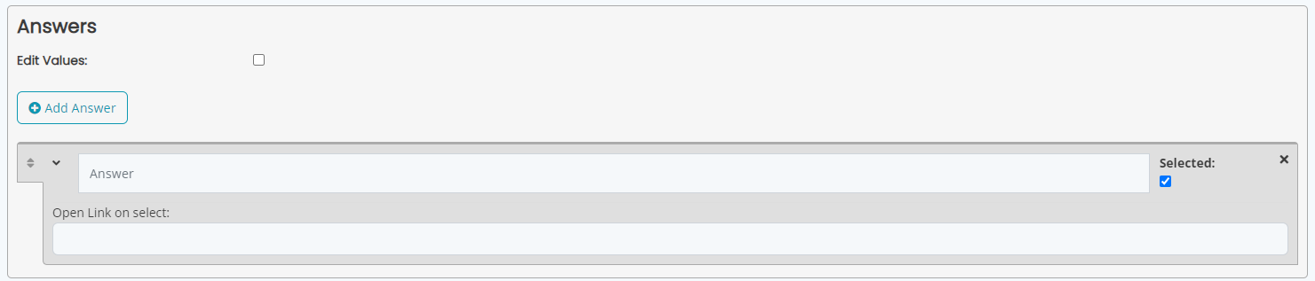
Some item types allow you to add multiple answers that the end user can select.
Click on the Add Answer button to add a new answer.
The "Edit Values" option will allow you to specify different values to be submitted than the text that is being displayed, for example if you want the text to say "Yes, please send me more information" but you only want to submit the value "yes" then you can specify that exactly. If Edit Values is not selected, the full text of the answer will be passed as the value.
You can check the "Selected" box to have the answer be selected by default.
If you expand the answer item you'll find an additional option called "Open Link on select". You can enter a URL here that will automatically be opened if the user selects that specific option. (only works on Radio button items).
Was this article helpful?
That’s Great!
Thank you for your feedback
Sorry! We couldn't be helpful
Thank you for your feedback
Feedback sent
We appreciate your effort and will try to fix the article